Initial Idea
For my final project, I wanted to focus on 3D modelling and texturing, creating assets specifically for games. I had a silly idea for a game revolving around the adventures of two female characters; Kat and Holly. Below is the initial drawing I did of these two characters.

“Kat and Holly are two best friends who enjoy partying, maybe a little bit too much! One afternoon after a particularly crazy night, the girls wake up hungover, not able to remember much of what happened the night before. They decide that the best thing to do is to make their way to their favourite fast food place for some burgers (the hangover cure). However, upon leaving their apartment, they discover that an alien invasion is under way… and they have slept throughout the entire thing. Still, the best thing to do is to make their way to the burger joint, because they are way too hungover to process any of this. Both girls find weapons (a crowbar and a camogie stick) and start fighting their way through the hordes of aliens blocking the way to Holly’s car parked down the street.”
This prologue sets up the basic premise of the game. I am not an aspiring level designer, so I haven’t thought much about game mechanics or what the developed plot is, the plan is to model and texture the main characters, enemy models and environments for the prologue/first level.

The above production plan was written within the first few weeks of the semester. I quickly realised after beginning the concept art stage of the project, that I was being overly ambitious. I decided to abandon any plans for an opening animation, level design and game mechanics. I instead decided to focus on creating only two character models- no enemy models- and one room, the living room of the characters’ apartment, where the story begins. This way I could focus on creating stylised, well thought out character and environment models.
Character Design Begins
All I had to begin with was the initial drawing of my two characters, however they are in a generic anime style, and I wanted my characters to be much more stylised. I also wanted to make sure my 2D character designs would be easy to translate into 3D design. Another thing to keep in mind was the overall aesthetic of the hypothetical game. I’m a big fan of low poly, early 3D games graphics. This is a trend that is becoming prominent recently in both AAA and indie games, for example “Totally Accurate Battle Simulator”. I wanted to create a game that would not look out of place on PS1 or N64.
After watching Garbaj’s videos on youtube, I felt that the characters I had in mind would look good in a low poly style:
I also watched this video on creating character sheets, as it’s not something I’ve done much in the past.
I wanted my two main characters to be similar in personality to the characters I created for my Netflix pitch project in the previous module. I began designing my characters for this project based off the same fashion mood boards I made for the previous module.


With this in mind, I began sketching my main characters:


I sketched my characters inspired by the aesthetic of the low poly, “chibi-esque” characters from Final Fantasy VII (below). However, I felt that the very large feet, shoulders and fists are very unique to FFVII, and I wanted my characters to be slightly more human in proportion. I also realised that although I was striving for a low poly aesthetic, I did not have the same system constraints as game developers in the 90’s did. So I could allow my models to have a little more geometry, whilst still staying true to the chosen aesthetic.

I did a bit more research on games that featured low poly graphics, but still had a vibrant colour palette, as this was also important to me. I happened to find “Mega Man Legends”. I personally have only ever played Mega Man 2, so I’m not familiar with any 3D Mega Man games, but I completely fell in love with the aesthetic of this game!


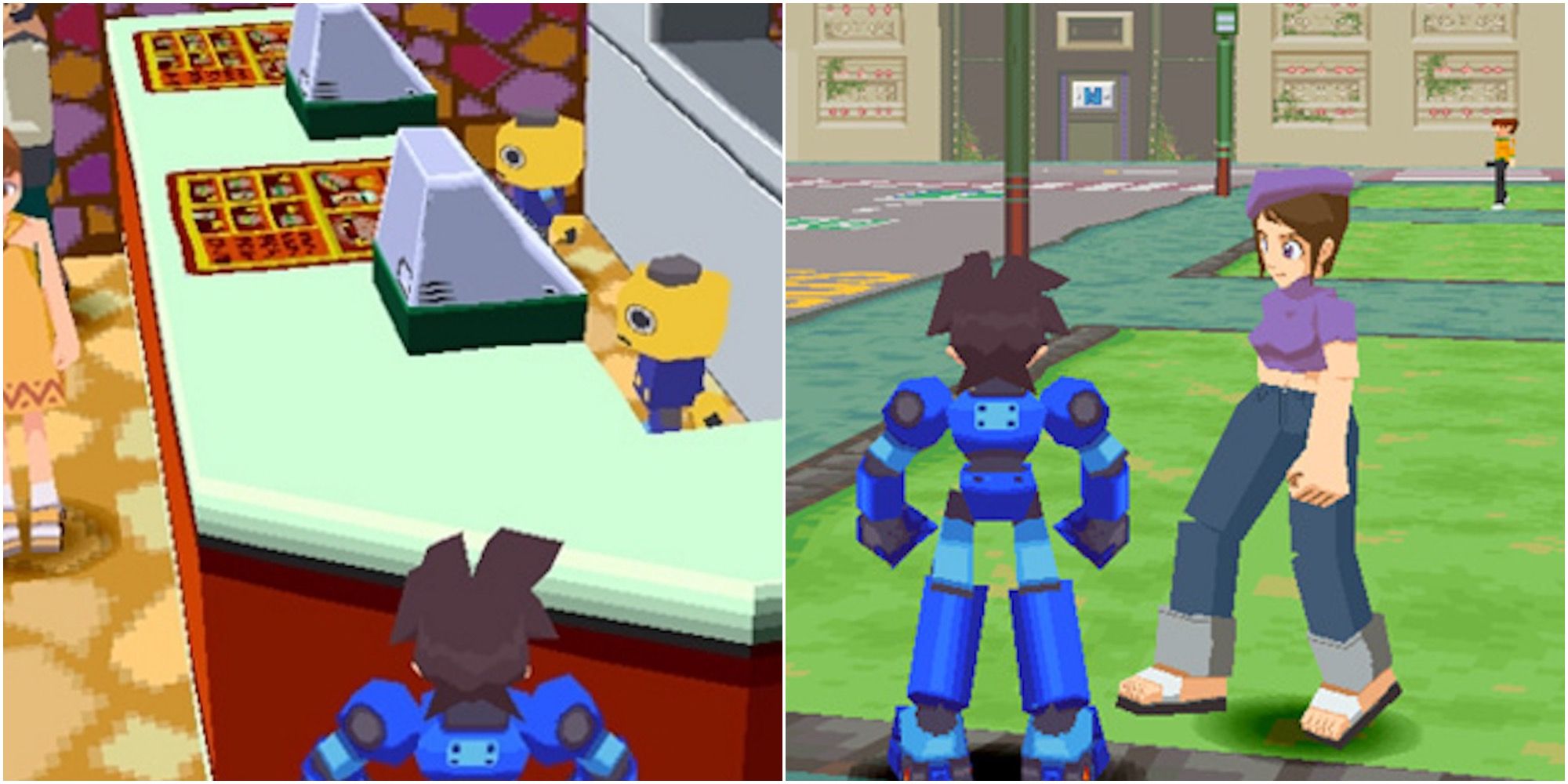
I also really like how the 2D promotional art from this game translates into 3D


I decided that for my two characters, I would take inspiration from the proportions of Lara Croft’s character model from the early Tomb Raider games. I’ve always loved how feminine her figure is, and I wanted my characters to have distinctly feminine silhouettes too.

I decided to watch a few videos on character design too- these women would be the main characters of this game, so I knew how important it would be to make them as interesting looking as I possibly could.
I went back to procreate on my iPad and created these final designs of Kat and Holly! I made sure to draw them from the front and back, as I would be using these designs as an outline to follow when modelling in Blender.

Holly

Kat

I was really happy with the finalised character designs! I was struggling to decide on proportions in the beginning, but I felt that I’d arrived at a concept that was really reflecting all the features that I wanted the characters to have- low poly and stylistic, but still realistically humanoid. I also decided not to include any flared clothing in Holly’s design, as I felt the jeans and long sleeve shirt would be easier to model. I’m happy I made this choice; Holly is a laid back, stoner type of character, and this is still reflected with her hippy hair and relaxed clothes. Kat is more of an e-girl/ goth character, so I really wanted her to wear fishnet fabrics and long over the knee socks. I also knew that these would be easy designs to do, as they would be purely textured and not modelled.
Updated Production Plan
I wrote the following production plan just before finishing my character concept art. This production plan was more in depth than the initial one, and took into account all the things I felt I could achieve within the given time frame. I am very lucky to already have a full time job as a 3D generalist with a local indie game dev company, but working full time meant that my spare time would need to be used effectively if I was going to get my Master’s degree finished!

Environment Concept Art
I had spent a lot of time researching and stressing about my character concept art, so to keep on track with my production plan, I commissioned an artist friend to create concept art for the girls’ apartment environment. I wanted the art to be based off the layout and design of my best friend’s actual apartment, so I sent my concept artist photos of her apartment and he drew the following:


Credit for these illustrations goes to @zizoose (instagram)
He made a few changes but I was very happy with how these designs came out! However one of the things I like about my friend’s apartment is the electric stove she has in front of her fireplace- she displays crystals and incense on top of it, it brings a lot of character to her living space! So I decided to include a model based off it when I got to the environment modelling stage.

My friend’s aforementioned electric fireplace heater
Character Modelling Stage Begins
I began modelling Kat’s body in Blender, using the same technique as one of my favourite 3D artists, SneepSnorp3D, extruding planes and following the concept art as a reference.
I made the right hand side of Kat’s model first, and then added a mirror modifier to create a full and symmetrical model. I didn’t want to model both characters individually, as they only had slight differences in height and proportion. I modelled Kat’s basic body without hair or clothing, then I moved onto Holly’s model, with the intention of completing Kat’s model afterwards. I elongated some of Holly’s limbs to better reflect her design, and changed the width of her chest and thighs. I then sliced Holly’s model in half and modelled her hair, as well as creating folds for the clothing and shoe shapes.


Completed clothes modelling on Kat

Modelling hair on Kat

Completed modelling stage, now placing seams and UV unwrapping.
Character Texturing Process
After UV unwrapping, I brought my character models into Substance painter.

I had no issues painting my models, but I struggled with getting the faces right. I decided to isolate in photoshop, the exact drawings of their faces from the final 2D designs, remove the background and export as a .png image file. I then imported the .png faces into substance painter as a texture stamp.


I was really happy with how the textured models looked! I was happy with how the faces turned out, there was a little bit of stretching but not enough for me to be unhappy with. Below are the texture images as exported from Substance Painter. I think in the future I would export with slightly different settings, so that the dilation and padding aren’t quite as messy looking. But it doesn’t create any issues so it wasn’t anything that needed fixed!


Experimenting with Mixamo Auto Rigging and Animation
I used Mixamo.com to auto rig my character models and animate them, as I was really excited to see them come to life! I wanted to make this project entirely about modelling and texturing, but I knew it would be important to have decent rigs for any future development on this project beyond university.

As you can see in the animation, the shoulder bone in the rig was affecting part of Holly’s hair, and her right arm goes a bit wonky. I fixed this issue in blender by removing and adding skin weights where necessary.

Modelling The Environment
I had designs to work from for the entire apartment, but I decided to just focus on one room- the living room. I started modelling the living room environment by beginning with a cube- I flipped the normals, so I could later paint textures inside the cube, creating walls, a floor and a ceiling.

I added my character models to the scene so that I could get a better idea of scale for the living room environment.

I added a surface subdivision modifier on the couch and arm chair, as I felt they looked too blocky- the reference couches are comfortable leather couches, and the blocky versions didn’t look very comfortable.

Rounder looking sofas

Modelling the curtains


Can’t have a house without a house key!


UV unwrapping all these items took a while, I placed them all in the one UV map. I wanted all the objects in the room to use the same image texture, as this would make the resolution for each item smaller. The intention was to keep this process as similar to that of early game modelling as possible. I also had hoped that having everything have a fairly low resolution would make it look a bit more authentic in terms of the early games graphics aesthetic I was aiming for. I also decided at this stage that the walls, ceiling and floor would use a separate texture image from the contents of the room. I left a bit of space in this UV map in case I wanted to add more objects to the room later.


Forgot to UV unwrap the house key, I was still able to add it to the first combined UV map though
I grouped several different objects together in blender, such as wooden items, metal items, the sofas, soft furnishings etc and applied a different material to each. The reason for this was so that when bringing the combined .fbx model into Substance Painter, I would be able to easily paint these objects without overlapping on other areas of the UVs. I applied a random colour to each material so I could better visualise how I would apply textures.


Environment Texturing Process
I began this process by painting down basic colours on all the items in the room, and then adding patterns to fabric objects. I also grabbed a royalty free cartoon wood texture from google and edited it in photoshop for use on the floorboards and wooden items in the room.


I took a few royalty free designs from google for various photo frames and tapestries on the walls in the living room. Each image texture being brought into Substance Painter has to be perfectly square to work with the brushes- any other shape causes deformation. I brought my images into photoshop to quickly edit them for this purpose.

After exporting my finished textures from Substance Painter, I remembered that Substance Painter does not have a setting which automatically exports materials into the one texture map. I had several materials in the one .fbx file, as demonstrated earlier. I found a free piece of software from this youtube tutorial which combined all my exported base colour images into one texture map. This was a big time saver, as it meant I didn’t have to bring every image into Photoshop to combine them!

All my separate exports from Substance Painter

Using Texture Set Combiner saves a lot of time and it’s very simple to use

The combined single texture image!

And the same process for the walls/floor/ceiling texture

I noticed these grey lines in my models where the UV seams were placed, I quickly remembered the importance of texture dilation and padding! I re-exported my textures from Substance Painter with a few pixels of dilation, re-combined them using Texture Set Combiner, and the issue was fixed.

You can see it in the above image on the top right and bottom left corners of the photo frame

Fixed!
The gif below shows the difference between the texture map with and without dilation. Those few pixels make all the difference!

Experimenting With Material Shaders in Blender
The intention all along was to take my models into Unreal and set up shaders there, but I had a go at experimenting with different shader settings in blender after watching this video
I usually use “Principled BSDF” when setting up materials in the shader editor in Blender, as this is the standard and it allows for several maps to be used, such as normal maps, roughness, metallic, height etc. However because I am making models for a low poly, early 3D graohics style game, I am only using BaseColour maps. I experimented with using an “Emission” shader instead of a Principled BSDF shader. The result was a flat lit material that did not require additional atmospheric lighting- it looked like a well lit room, which was my intention. Below you can see the difference in Blender’s rendered viewport between Kat’s model, which has a Principled BSDF shader set up, and the environment, which has the Emission shader set up.


Cell shaded look, emission shader

Principled BSDF shader with one ceiling light source, which creates a lot more shadows.
I was now faced with a dilemma, which one looked better? The emission shader didn’t allow for any shadows, and a lot of shadow would need to be painted, which would mean putting more time into the textures. But the Principled BSDF shader settings didn’t look as vibrant as the emission shader settings.
Experimenting With Shaders in Unreal
I decided to shelve the blender file for a while, and instead experimented with bringing my assets into Unreal Engine. I had to watch a few videos on the basics of unreal, as I hadn’t used it in a year and I already had limited knowledge of it!

I decided to begin with the pre-set Third Person Example Map, and I deleted some of the assets present

How my environment looked with the pre-set lighting and materials
I watched this video on setting up a PS1 style shader and copied the tutorial steps exactly, which worked surprisingly well! I also watched the below video, but as I was working in a different version of Unreal, I couldn’t follow the exact steps.


I really liked how the shader made everything look, but I was having big problems with getting the character to move within the environment. Of course I’m not an aspiring level designer or anything, but I really wanted to get a basic walk animation working with the player controller.
I had to learn a lot about colliders that evening…

My character kept falling through the mesh of the room, so I tried adding a nav mesh bounds volume. However, the automatic colliders on the furniture meshes were interfering with the nav mesh.

I removed all collision from every mesh except for an invisible plane aligned with the living room floor mesh. It’s not the best solution but it was the best I could come up with after getting some advice from a fellow game dev friend.

The character capsule wasn’t scaled correctly to Kat’s model, fixing that corrected the issue I was having with her “floating” on the ground.

Changing Route – Switching to Unity
On top of the issues I had with colliders, I had a lot of issues trying to animate my character model in Unreal. I followed several tutorials to the T, but I couldn’t get the armature of my Mixamo rig to match up with the one in Unreal engine. After consulting one of my co-workers, I decided to switch to Unity. My co-worker told me about a PSX shader for Unity that he had recently used, linked here:
https://assetstore.unity.com/packages/vfx/shaders/psx-shader-kit-183591#reviews
I really liked how this shader looked! I quickly got to work bringing all my assets into a new Unity project. I decided to use a third person game template project, as this meant I would not have to set up the third person camera myself. It also meant that my character model could use the same basic walk, run and jump animations as the Unity template. This was much easier to implement than in Unreal! I followed the tutorial below to bring my character into Unity:

Looking back, I really wish I had used Unity from the beginning! My intention was to set up a basic room environment with a controllable animated character and PSX shaders, and this was so much quicker to accomplish in Unity than Unreal. However, I did learn a bit about setting up shader nodes in Unreal, and I’m glad I found where my preferences lie for future projects!
Final Show Reel Renders
Although my project was centred around utilising my 3D modelling and texturing skills, I decided to create a few fun animation renders for show reel purposes. I decided it would be easier to render the Mixamo animations in Blender, so I looked up a few tutorials on creating PSX shader style renders in Blender. I found this one very easy to follow, and I liked the result!

The nodes were very simple to set up, and I really liked the effect I got. The only issue was the fact that these settings made the aspect ratio… unfavourable. I was able to fix this in post by cropping the video. This did cause a loss of resolution, but it’s not terribly noticeable because of the PSX effect. This is something I will continue to work on in the future, particularly for the university showcase in June, as I will need a very professional show reel for that!
In my show reel I wanted to use Mixamo animations that would give an impression of potential gameplay, as well as cut scene style animations. I decided to include a basic walk cycle, an idle animation, a camera pan showing the environment, and a silly dance scene. When I went to search Mixamo for an idle animation, I noticed one that had hand grips for a weapon. It was in that moment, I remembered that my characters were supposed to have a crowbar and a camogie stick. Well, I went ahead and modelled the camogie stick!


She’s a dangerous woman!
The rest of the Mixamo animations were straightforward to to implement in Blender. All that was left to do was to render the four animations, edit those together and crop the edges in Blender, and that was my basic show reel completed!
Final Reflections and Conclusion
As happy as I am with the final result, there are a few things I wish I had done differently in this project. I think I spent a lot of valuable time getting the concept art together. I also feel that I should have made an asset list instead of relying on the environment concept art for my assets- it was because of this shortcoming that I managed to forget to model weapons until the last minute. I also feel that if I had managed my time better, I would have had more time to experiment with shaders in Blender, which would have given me better renders for my show reel. I regret not doing this- the shaders I used in Blender and Unity would have looked much better if I had put more shadow and highlight detailing into the textures. If I had experimented with the shaders earlier in the project, I could have noticed this early on. Therefore, I would have had the time to go back into substance painter and add more details to the textures. However as this project will likely continue for me beyond university, I can make changes to the textures in the future.
I regret not doing more research about Unity and Unreal earlier in the project. If I had experimented with importing models and animations into either engine earlier on, I would have known which one was more suited to my skill level and needs.
I feel that I have learned a lot about myself in this project, I have learned that I need to better plan my future projects, and I have learned a lot about my chosen area of animation/game dev, as well as other skills. I never imagined that I would be doing much in Unity beyond importing models and creating materials, so it was definitely a learning experience to try implementing colliders and setting up shaders!
Overall I am happy with my project, I feel that for the most part I achieved what I set out to do, which was to create character and environment models in a retro style, optimised for use in game engines. I’m excited to continue working on it in the coming months!

